Thursday, April 25, 2013

Wind Chime makeover

Greetings!
The current challenge at eclectic Paperie is to use flowers on your project!
Easy-peasy everybody - won't you join us?

I picked up this wind chime at the gift shop in my grocery store. While it is very pretty as it is, I felt that it would be greatly enhanced by the addition of some Tim Holtz Distress Paint!
I cleaned off each flower with vinegar and coated each one with Studio Gesso.
The paint colors I chose to use are:
seedless preserves, victorian velvet, mustard seed, wild honey, broken china

It took two coats of paint to get the nice creamy look I was going for.
A little dot of Ranger Liquid Pearls in buttercup is the perfect finishing touch.
One of the flowers was missing, (luckily I didn't notice this until after I brought it home or I might not have purchased it!) this gave me the perfect opportunity to add a little metal butterfly by Blue Moon Beads which I blinged up a bit with colored rhinestones. (click photo to enlarge)

I'm pleased with this make-over - what do you think?
  I hope you'll put together a card, layout, or off the page project using flowers and link it up with us at eclectic Paperie!
If you are interested in purchasing these yummy Tim Holtz Distress Paints, I've linked them up to the awesome eclectic Paperie online store for you.

Friday, April 19, 2013

Upcycled box

Greetings!
Today I have an upcycled box to share with you. 
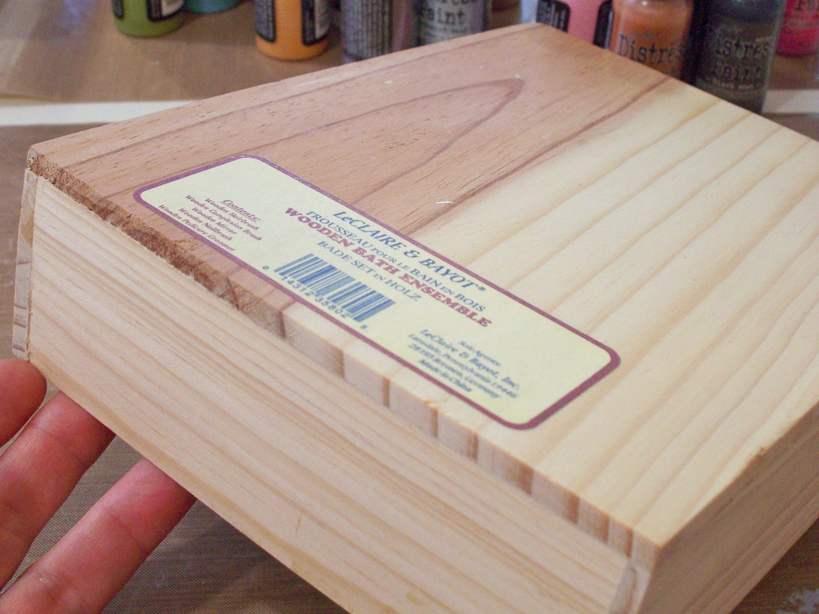
I was in need of a wood box to house my collection of Tim Holtz Distress Paint. My mom and I went to the thrift store where she lives and found this perfect little beauty - 50 cents!

The base layer of my remake is a newsprint flyer from a local antiques mall. I used the pages with the stories about ceramic figurines, tearing them apart and collaging them on.
First I used the Wendy Vecchi Studio 490 Lovely Leaves stencil and The Crafters Workshop harlequin stencil to add some detail with Tim Holtz Distress Paint and Faber Castell Pitt artist pens. After that I added some butterflies cut from napkins. Once  they were applied and had a layer of Mod Podge over them, I shaded them with Faber Castell Big Brush Pen in cold grey III. Next came some stamping with the She Script stamp by Unity with StazOn ink in timber brown and a dot stamp by Hampton Arts in Liquitex acrylic unbleached titanium paint. I discovered that you can color Wendy Vecchi White Embossing Paste with Faber Castell Gelato and it doesn't change the properties of the embossing paste - SWEET! So I mixed the paste with yellow gelato and applied it to my box through the "chicken wire reversed" The Crafter's Workshop stencil. 
There were no handles for sale at the flea market this week and I searched the basement for some with no luck so I headed off to the hardware store and found these perfect ones. Of course the screws that came with them were an inch long but my sweet husband took care of that and attached them for me.
I lined the inside with cork
and the bottom with a page from the antiques mall flyer.
Now I just need to contact Mr. Holtz and ask him to not make any more than three more colors of Distress Paint as that is all I have room left for!

I've linked up the products I used to the awesome eclectic Paperie online shop for your shopping convenience! The store is loaded with great products and she ships really fast so (s)hop on over!
I am entering my box in the Take the Challenge with Mou for April over at the Faber Castell Design Memory Craft blog and at Ronda Palazarri's blog calling for texture.
Thanks for stopping by today,
I appreciate your comments!

Thursday, April 11, 2013

Gift Bag

Greetings!
Today I have a gift bag to share with you.
I purchased a few items from my local garden center to give as a gift and they came in this bag:

 Rather than purchasing a gift bag to give the items in, I decided to decorate this plain bag myself!
I started with a layer of Studio Gesso, randomly stamped the Unity Co. She Script Stamp using Ranger Archival ink in Olive and added Tim Holtz "forest moss" Distress Paint applied with bubble wrap.
Using the Wendy Vecchi Lovely Leaves stencil, I created the flowers with Tim Holtz "seedless preserves" Distress Paint and Tim Holtz Distress Markers in dusty concord, aged mahogany, and forest moss.
The magic happens with the addition of Inkssentials Glossy Accents to the main flower petals - so pretty!
Across the top of the bag I added solid color cardstock from my stash and patterned paper by Fancy Pants Designs from the Lilac House collection punched with a Fiskars scallop border punch. A fussy bow created with BBP Monochromatic ribbons, American Crafts Twine, Twinery Honeydew Twine and raffia from my stash finishes the look! I linked up all the products I used from the awesome eclectic Paperie shop so you can easily click over and add them to your cart! I am entering this gift bag in the "scallops" challenge over at Frosted Designs. It has been a while since I've joined them and it was fun to play along again!
Thanks for stopping by today!
I appreciate your comments!

Friday, April 5, 2013

eP altered clock challenge

Greetings!
What a fun challenge we have for you going on at eclectic Paperie!
Design Team member Erin has challenged us to alter a clock!

When I first decorated my studio I found this clock at WalMart:
back then I decorated it like this:
Right from the start I wasn't super thrilled with this variation and Erin has given me the perfect challenge to remedy that!

Here is my newly altered clock:
So much more "me" and I am very happy with it!
This is how the whole thing came apart:
I started with a base piece of paper from the Authentic "Peaceful" line of paper which had script printed on it. This beautiful paper is very sturdy so I knew it would hold up to some altering. First I applied a light coat of Distress Stain in Picket Fence just to mute the pattern a bit. 
(here's a hint: whenever possible, I treat scraps the same way as my project, that way if I want to try something out that I'm not too sure of, I can try it on the scraps first knowing that they have the same underlying layers as my actual project.)
Next I chose a color palette from my collection of Tim Holtz Distress Inks and some Crafter's Workshop 6x6 stencils to work with. 
I used a fingertip dauber to apply the ink through the harlequin and herringbone stencils, then, using a palette knife applied Wendy Vecchi Embossing Paste through the mini chicken wire reversed stencil. If you've not worked with this embossing paste yet, you MUST get some - it is so silky and soft, goes on extremely smooth and easy, then dries flexible - it's fabulous! Using a sponge dauber I lightly ran across the embossed area going only one direction with gathered twigs Distress Ink to create a shadow effect on the chicken wire pattern.
In my stash are some Basic Grey chipboard stickers and that is where the flower and stem came from. I altered the colors a bit by adding Tim Holtz Distress Paint in peeled paint (green) and broken china (blue) as well as some Ranger Perfect Pearls in turquoise. The wooden birdcage came from a big box store but there are similar ones in the eclectic Paperie store here. I colored the birdcage with brushed pewter Distress Stain, the bird with broken china Distress Paint and the perch with walnut stain Distress Marker. The chain is dots of Inkssentials enamel accents in black. A bit of turquoise Perfect Pearls on the birdie makes him extra special! The numbers are Grungeboard, first prepped with Studio gesso then painted with Ranger Liquid Pearls in buttercup. All of the elements are edged in Faber Castell Pitt artist big brush pen in cold grey VI to help them stand out.
Imagine my delight when I put the whole thing back together and the clock still worked! - bonus!
Just for fun I added a row of washi tape by My Minds Eye from the Indie Chic collection around the outside. Now I'm kind of wishing I had added it around the inside edge also - but I'm surely NOT taking this clock apart again any time soon!
It is SO hard to get good pictures of anything with glass on it in my studio because of the (totally awesome) windows - but - you get the idea! 
Cute, huh? If you'd like to see the rest of my studio, click on the "My Studio" tab at the top of the page!
Here is a link to Erin's gorgeous altered clock. At the bottom of her post you will find links to the other amazing design team projects (designated with DT after the name). I hope you are inspired to find a clock that needs some jazzing up - have fun altering it then link it up. We'd love to see your work and get you entered to win a gift certificate to the fabulous eclectic Paperie online shop!
I am also entering my clock in the Seasonal Color Palette challenge over at the Ranger blog and the Altered Item challenge MCM#19 at Scrapbook Steals.


Thanks for stopping by, 
I'd love a little comment if you have a moment, 
have a lovely day!